Hey all. I got a wild hair and just started looking through stamps today. No clue what I wanted to color. Not much was jumping out at me. Until I came across my old Cornish Heritage Farms Mushroom Lane stamps. They are ADORABLE stamps, and I decided I needed to make a little red schoolhouse.
I looked up some red mushrooms and found all sorts with little white dots on them. OK. Call me weird, but I really thought that those little red mushrooms with white dots were just made up whimsical things. They actually exist. WOW. Ok... so I decided after I colored my red mushrooms that I had to add the little white dots. Once I had colored it (colors below), I started digging through my DCWV stacks. I have this one stack (the Green stack) that has all sorts of cutesy things in it - including mushrooms and owls and stuff like that. This paper was in there. So I cut out my mushroom (leaving a LITTLE bit of white around it (not what I usually do), and then added it to this sheet. Afterwards I used my Nestie to make the tag out of another paper in the pack, and mounted both of these on red.
The colors I used are:
E40, 41, 42, 43, 44, 47
G40, 43, 46
R32, 35, 37, 39, 59
Y35, 38
BG000
W1, 3, 4, C5
B41
Copic White for the dots.
Thanks for stopping by. Hope to see you back again soon!
Sunday, January 29, 2012
Wednesday, January 25, 2012
A New Bombshell Hop
New Technique that is! That is right - Alison, the Hostess with the Mostess has challenged us to celebrate the new year, with a NEW technique. I hope you arrived from Laura's Fabulous blog. If not, head on over to the Bombshell Blog to start this New hop of right!
So we had to pick a new trick. Well... if I am anything - I am an overachiever - so I chose to try TWO NEW to me techniques. OK... two really SMALL techniques.
The new techniques?? OK... so I did say - new to ME. The first is that I antiqued the "Frame" I used a Nestie and cut it out and embossed it, then got some gold rub and buff and applied it using a q-tip (and yes - it was actually the q-tip brand) :-)
The second technique was the crackle. I have NEVER been able to get this right. So I took the mermaid from the Mermaid Treasure set and colored her upper half. Once I cut her out I glued her to the frame and I applied crackle accents.
So I ended up happier with the crackle (Surprise surprise) than the "antiquing"... Maybe I should have stuck with a single technique. ;-)
Hop on over to Sparkly Mary's blog and see what she has cooked up for you. If you get lost along the way, then you can check back here, as I have the entire list below.
Bombshell Blog: http://bombshellstamps.blogspot.com/
Alison: http://alisonsrandomthoughts.blogspot.com
Laura: http://craftylittlewoman.blogspot.com/
Alaine: http://missalaineousmosaics.blogspot.com/
Sparkly Mary: http://sparkly-train.blogspot.com
Meredith: www.papercanteen.com
Cheryl: http://inktrap.blogspot.com
Paula: http://heyheypaula-heyheypaula.blogspot.com/
Kelli: http://www.cajunstampingqueen.blogspot.com
Stempelientje: http://stempelientje.blogspot.com/
Glittery Katie: http://ferrishyn-frontier.blogspot.com
Kathi: http://kathstales.blogspot.com
Have a great crafty day, and I hope this hop has inspired you to try something a little new.
Challenges I am entering with this Card:
http://sundaysketchandstamp.blogspot.com/2012/01/sunday-sketch-stamp-90-donnas-sketch.html
The Crazy Challenge # 103 - Vintage
Stamp with Fun Challenge #144 Cute Vintage - She is IMO one of the cutest Bombshell Stamps there is
Creative Card Crew #2 - Seeing Red
Monday, January 23, 2012
Bling it ON - Kenny K style
The Kenny K challenge this week is to Bling it up. You all KNOW I can't resist the blingy bling.
I colored her outfit up in shades of blue - B9x series to be exact. I wanted a rich blue. Those are the ones I usually use for Denim, but this time I just colored a little darker and a little bit smoother than I do the denim look. Her skin is E00, 11, 13. The browns are primarily E3x and I added in some dark E79 to some of the piping to provide some contrast. The golds are Y11, 23, 26, 28, and the mettalic on the tank and her shoes are C1, 3, 5 with a touch of E04 to make it look a little rusty.
Her hair and her skirt are BG70, 72, 75. I added in the black dots with enamel accents. Then came the BLING. I used dark blue Jolees to go around the oval lacey Nestie. Then I wanted it to appear as if the gun was shooting. I used multishaded blue and brown Jolees in various sizes and did the bling coming from the gun.
I hope you all enjoyed this today. Don't forget to come back on Wednesday for the BOMBSHELL Blog hop.
See you soon!
Saturday, January 21, 2012
Traditional Wedding Gown
Hey there lovely friends!!! I got in my "new to me" stamps from Bombshell the other day, and one of the ones I got was the gorgeous Lucky Bride. She reminds me of the lovely Spanish brides. Traditionally, the Spanish Wedding Gown was black, so I colored her up in lovely black satin. Then I added a touch of red to dress it up. The greys are C1, 3, 5, 7, 9, the reds R22, 24, 29, 39. Her skin is E00, 11, 13 and her veil is BG0000 and E50. I chose t5o try to go pretty simple with just the silver paper behind and then adding the black bow with white flower and pearls. The hose were a little plain, so I chose to try to mimic the swirls from the veil on her hose... and make it look like lace there as well.
I am entering this in a few challenges this week.
My Sheri Crafts Challenge - #77 New Things - - the stamp is NEW!
Drunken Stampers Challenge - #81 Love - The hearts are on there, and it is meant to be a bridal card
SCS Friday Free for All - Have a Heart or Two - - There are hearts on the fan
Stamp, Scrap and Doodle Saturday - Have a Heart
Hope to see you all back here again soon! Have a great rest of the weekend.
Thursday, January 19, 2012
Sweet Pea iCopic Fairiy
The iCopic challenge this week was to give some love to your lonely Copics. You know - those ones you don't use very often. Wow... I can actually say that of the colors I used on this, the R29 and 39 are the only colors I use frequently.
I used one of my Sweet Pea stamps. I love the images. They are so pretty. I started my color scheme with the greens. I picked the greens I use the least - those ended up the YG91, 93, 95, 97, 99. I colored her dress. I really wanted to work on adding a lot of depth of color. So I made sure I went across the entire spectrum. Once I was done with that, I moved onto the Poppies. Those are red... OK... So I looked at my more orangey reds - R02, 05, 08 and colored them up. I added in the R29 and 39 on the edges. The yellow centers are Y15.
I moved on from there, to the fairy's skin. So I looked at the colors I usually use, and decided to go all out with this challenge. I have not used (that I remember) YR0000, 000 as skin colors. So Voila. I used a little BV000 in the shadow. Now - onto her hair. Hmmmmmm.... Of the browns, I KNOW I don't use the E9x series, but I don't have enough of those to work with... Plus the ones I have pretty much would make it look like her skin is peeling off of her head in strips. So that won't work. So I moved to the next least used... E70, 71, 74, 77, 79. I then added a little stardust to some of the strands to make it sparkly. The last two colors I used were for the leaves and stems - BG93 and BG96, and then Y0000 for the background.
Although I crossed across pretty much all levels... the 2x, 0x, 7x, 9x, etc... and not natural blending families. I am pretty happy with how it came out. (The sentiment is from Flourishes).
Hope you come back soon. :-)
Tuesday, January 17, 2012
Why don't you Tag-along with the Bombshells?!!!
Ms. January, Laura B., has challenged everyone to a game of tag! That's right the January Pin Up challenge of the month was to create a tag using your Bombshell Stamps, or make a project that includes a tag. I got new to me stamps in the other day - the wonderful Alter Skulls, and decided that I needed to make my project using that set.
I used Warm Greys to add some dimension to the skull itself. The reds are R32, 46, 59. The yellows are Y32, 34 and then I added in some R46 into it to give it some color. The little swirls on the skull I went over with a green brush copic multiliner. Once I was done coloring up the skull, I went over the black in the eyes, nose and mouth with a black brush multiliner. I love how it looks. I used a Nestie I have to cut out the brown lacy background, and then added some hotfix crystals in amber to the different areas.
Now... Why don't you head on over to the Bombshell Blog (Wednesday morning) and see what all the lovely Bombshells have in store for you. And then, go ahead and enter into the challenge. You could win yourself some new rubber!!!!
I am entering this into the following challenges:
Tic Tac Toe - The Crazy Challenge (lace, image, gems)
No Flower Embellishments - Crafty Cardmakers Challenge No. 59
Sunday, January 15, 2012
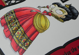
Queen of Hearts
This is the Queen of Hearts from Kraftin Kimmie's December release. I had so much fun coloring her. I colored her once before, but somehow she disappeared under the new sectional that I can't move. :-( I really liked the colors on her there too, oh well... I will find her eventually.
I followed the Kraftin Kimmie Sketch Challenge Sketch (and I am entering this in that challenge. I colored her up primaril with the R2 series for the reds, although there is a bit of R59 in there as well. The Yellows are primarily Y2x series, but I started with a base of Y11 to give it a bit more brightness. The shadow is BV00.
The sentiment is a little weird to me. My husband agreed that it didn't quite fit the Red Queen theme from Alice in Wonderland... but I think it fits the card pretty well. I used the red heart cards from a little Jolee's pack of cards, and I matted all of them in black to mimic the rest of the card. And the ribbon is two different ribbons. I think it worked out well considering where the panel on her dress is, and that it kind of matched. Other than deciding to layer the ribbon there, it was actually a happy accident in that the sketch had it going across there. I always intended to do gold ribbon, but saw the red and black dots and thought it added something.
OK... Enough rambling. Hope to see you back soon. I have a really blingy project I worked up for the Bombshell Pin-up challenge that goes up on Wednesday... and I am getting ready to be all colorful a bit more in a few. :-)
See you soon!
Wednesday, January 11, 2012
Ahoy Sketch!
It's Bombshell stamps sketchy time! Kathi came up with this gorgeous sketch to design to this month. I decided to use Ahoy Sailor with the DCWV Tradewinds paper for my take on the sketch. I stamped the image twice. Once on the base paper that I cut out with a Nestie. While still in the Nestie I used B41 and B45 to airbrush. The color was a little bright when done so I went over that with the C3. I tried to focus the airbrush more on the outer edges and get lighter as I went in.
The second image I colored up with R32, 46 and 59, B91, 93, 95, 97. I added a light touch of B0000 to white of her collar and her hat. Her skin is E000, 00, 11 and a dab of R20 for her cheeks. Her hair is E23, 27, 29. Once I assembled the card, I cut out the second image and pasted it on top of the first image on the base. I did it this way, so that her tie could fit over the bottom panel.
Now, I hope that you head on over to the Bombshell stamps blog and check out what all the Bombshells have prepared for you this month. And remember if you play along with the sketch challenge you have a chance to win a free set of stamps.
Where is the bad in that???!!!
See all of you soon!
Friday, January 6, 2012
Smooth Sweetie
Hello there. Having a great evening just a coloring away. I actually designed this card tonight to meet a couple of challenge requirements, and I am SOOOOO happy with how it turned out.
iCopic Lover is having a challenge to color smooth or shiny hair. That is where I started... See I don't have a lot of images with smooth hair. So... I found this cute Paper Pretties image I have and then went and looked at the Paper Pretties challenge for the week. They want you to use brads or eyelets on your project. OK... hmmmm... I don't have a lot of those. Luckily I dug through a bunch of supplies, and found these three flower brads with blue sparklies.
I colored the hair with E21, 23, 25, 29, 39, 47. Whew... that was a lot of browns, but as I said I really like how it turned out. I also used BG11, YG21, 23, 25, BV00, 11, 13, B21, 23, 24, 26 and G21, 24, 28. Her skin is an unusual combination of E000, E11 and BV000 with R20 for cheeks and lips.
I really tried to work on the shading on her face, and shadows... I think my favorite part was how her shadows on the face ended up looking. I don't know why. Just it looked more "real" than usual.
OK... So as I said I am entering this into the Paper Pretties challenge, and the iCopic Lover Challenge.
Have a great weekend and see you again soon!
Thursday, January 5, 2012
Dark Heart
I made this card as a tutorial over at Bombshell Stamps Blog scheduled for Friday the 6th of January. For the heart I used Sacred Heart Art, and stamped the image with white on black linen paper. I embossed over it with white EP, and then colored it with a white Prismacolor pencil. I cut the heart out, and then popped it up over the black linen paper below it.
The white paper with the polka dots was made by brayering versafine onyx black onto a Cuttlebug embossing folder. I ran it through my Grand Calibur and then I clear embossed over it quickly. I then just started layering. Once done, I wanted the theme of the dots to continue and so I added the pearls around the edges, in the corners, etc...
I hope everyone has a great lovely crafty weekend!
Tuesday, January 3, 2012
Quick Tag
So... I have a really quick tag today that I made for the Kraftin Kimmie challenge.
The tag itself was from VERY heavy black cardstock. I added glimmer mist, and then sponged on some purple and green. Once I had all that done I VersaMarked it and then Clear Embossed it. It has a really cool effect in person. You can kind of see the swirly colors here, but not as well. The Cheshire Cat image was colored with RV62, 66, 69 and BV00, 01, 02, 04. Over the top of it I added Crystal Effects to make it more sturdy. The tag is layered and in the end I added these picks I found in the Wedding Area of Hobby Lobby. There is not as much difference in the purple on the tulle compared to the purple on the cat. Again - I NEED to work on my picture taking skills.SIGH.
OK... That is it for the day. Hope to see you again soon.
Monday, January 2, 2012
A Steamy Dip
Hey there all. I have been even more inspired due to the December Bombshell Theme of Steampunk to get more steampunky all around.
I used this amazing Kenny K image to create my Steampunky vision. WILDLY enough I picked the colors and then found paper to match the colored image. I couldn't believe I found this paper. I nearly fell into shock when I did, and that it worked so well.
Because she is a lovely deep sea Steam gal, I decided to use a lot of BG7x series in addition to the browns. For the browns on her outfit I used the E7x and then the boots and leather stuff are E3x series. As always, when I want to show something sheer, I color the underneath part as if the sheer overlayer is not there. Then I use the color of the sheer items and color slightly over it to make sure that the underneath AND the sheer colors are mixed in.
I had a LOT of fun with the golden and metalic colors on this.
For the gold, I used Y11, layered with Y23, 26 and 28.. then I added some E07 in spots to add some red depths to it. For the silvery metal pieces / or pewter / iron???? I am not sure what the metal would be, I used the C1, 3, 5 and a little 7. Once I was done, I used a little bit of E04 to give it a patina. I LOVE love love overlaying the colors with the Copics. It gives such interesting depth and changes the look entirely.
I finished her up by adding enamel accents for buttons and stuff on the leather. To get them that tiny was REALLY hard... I did pretty good on most. HAHAHA. Because it is still going on, and it fits the Challenge of Anything Goes - - I am entering this into Kenny K's challenge this week.
Ok, Hope to see you back soon. Have a great day. I intend to as it is back to work tomorrow!!!!
Sunday, January 1, 2012
New Year - New Post
New Card!
I made this the other night. I prmarily used Y0x family with a little Y1x thrown in... the greens are YG21, 23, 26. The Image and Sentiment are Flourishes. The paper is Basic Grey with DCWV Shimmer cardstock for the green and yellow. I popped up the heart on the green cardstock, and I think by using the darker colors behind the lighter ones on the image, it almost looks as if the flowers are layered on themselves.
I hope you all have a gorgeous 2012, and hope to see you back again soon.
Subscribe to:
Posts (Atom)