Hello people out there. I made this card for the CMC Copic Challenge which was to use Blacks and greys with an image. We were to color it any way we wanted, but make sure we used a lot of blacks / dark greys in the image. This was an interesting one. I received the Growing Hearts set a few weeks ago, and I have had her stamped up for a while, but hadn't yet colored her. I always pictured her in blues or purples, but I figured what the heck... lets try.
I used Copics C0 through C9 and a Copic 0.05 multiliner to color her up. Once I was done with the shading of the greys / blacks, it needed something else, so I pulled out the R20 and gave her a slight blush by picking up the color with the C0 and using that. I also added it to the heart on her forehead, the flowers and the heart she is holding. OK - tangent here - I keep thinking it is a chili she is getting ready to eat. I know most people don't eat raw chili's but I have a co worker that does. We have a company garden, and we have grown a lot of peppers and she will pick several and eat one on the way back to our cubes... so as soon as I saw this lady holding this I thought chili pepper!
OK. Back on Topic. :-)
I cut her out and colored the edges with black. Then I used Nesties to cut out the black inner oval and the pink oval with scallops. I raised it up on pop dots. I have had some pink tulle mesh for forever and it just looked so cool with the black underneath. I tied like a Christmas bow. In the end I added the little pink bling and the black pearls as well.
I am so happy with how this turned out!
So I am entering into the Blacks Challenge for CMC Copic Challenge group.
I am also entering into the Use It Tuesday Challenge - Ribbon (Hoarded ribbon)
EVERYONE - have a GREAT weekend! Hope to see you again soon!
Thursday, August 30, 2012
Wednesday, August 29, 2012
Let's Hear it for the Boys!!!!! while we HOP
This month's theme for the Bombshell blog hop (You should have arrived from Rachael's beautifumous blog) is "Let's Hear it for the Boys." I don't know about you but I CANNOT get the song out of my head now. Alison has challenged us to make a Boy themed card. I could have made the original one I was thinking of, but then I couldn't have posted it and maintained my PG rating. But you know what else it is? It is Bombshell's FIFTH BIRTHDAY! So I decided to make a birthday card for a 5 year old boy for this Hop.
I used some pirate paper from the All About Boys DCWV stack. I matched that with the image of the two Bottlenose Dolphins from Mermaid Anchor, and the Happy Birthday banner from Banner Sayings.
The dolphins are colored with B41, 45 and C3. The reds are R32, 35, 37 and the yellows are Y32, 35, 38. The rope is the standby E31, 33, 35, 37. The silver being C1, 3, 5. Once I was done, I went over a bunch of it with a sparkly pen.
I used Nesties to cut out the smaller navy level and then layered the pirate speak paper over that with the next size Nestie cut out. The other nifty thing I had fun with was the knot. This is called a Carrick Bend knot. I found a cool page to instruct me on how to make this.
Ok... now that you have seen my Birthday card, I hope you will hop along with us.
Bombshell Blog: http://bombshellstamps.blogspot.com/
Alison: http://alisonsrandomthoughts.blogspot.com/
Alex: http://www.paperandstring.blogspot.com/
Rachael: http://rachaelshandmadedesigns.blogspot.com/
Alaine: http://missalaineousmosaics.blogspot.com/
Kelli: http://www.cajunstampingqueen.blogspot.com
Jodi: http://www.elamdesign33.blogspot.com/
Laura: http://craftylittlewoman.blogspot.com/
Sparkly Mary: http://sparkly-train.blogspot.com/
Terra: http://www.moresmearedink.blogspot.com
Kim: www.craftypinkanchor.blogspot.com
Stempelientje: http://stempelientje.blogspot.com
Nicole: http://madebynicole.blogspot.com
Glittery Katie: http://ferrishyn-frontier.blogspot.com
Kas: http://www.artloveschaos.blogspot.com
Kathi: http://kathstales.blogspot.com
HAPPY BIRTHDAY BOMBSHELL!!!!!!!!!!!!!!!!!!!
Thursday, August 23, 2012
Flowers to match paper that I ended up not using. :-)
So I colored up these new Flourishes stamps based on the DCWV Linen Closet paper. Then I made the card and didn't incorporate any of the paper. Cuz that is how I roll. HAHAHAHA... I have no clue, but somehow the card took a different track than intended. How does that happen?
I stamped the image twice, and then colored it up very simply. The aqua colors are BG10, 11, 13. The Beige Flower is E40, 41, 42, 43. The greens with the G40, 43, 46. For the Aqua, I colored the entire image up in BG10. Then I slowly added in color at the edges of the leaves. Once I was done, I went over it all again with the BG10 to smooth it out.
I cut out both images leaving a little white edge. I typically don't use a white edge, but because of the leaves extending out on the ends I decided to try this. The background white is an embossing folder with black enamel accents added in the center dots.
Monday, August 20, 2012
Rocking away
Hey there all you peeps out there in blogland. It has been a long day and I am just thrilled to be sitting at home in my pjs and able to upload a card to the internet. (There was much screaming and hitting of the desk this weekend).
I was trying to pull out some stuff I haven't played with in a while and pulled out this adorable Belles and Whistles Stamp Image. I decided that even though it is a Christmas image, the horsie wouldn't necessarily be Christmas colors. So I colored the horse and girl up first trying to ignore the Holly and all. Then I ended up adding the holly.
There are SOOOOOO many colors I used. Too many to list.
The sentiment is from Stamps by Judith.
Hope you have a great week. Going to start making a list for the CK Scrapbook Convenion this weekend. I am not taking any classes, but I am going shopping! YAY.
I am entering this into the following challenge:
CCH# 127- Anything Goes
Wednesday, August 15, 2012
NOOOooo People Allowed!!!
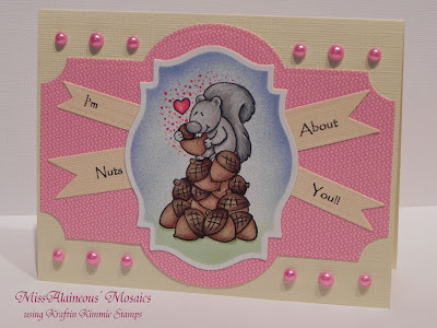
I was determined to do this challenge. And I was thrilled when I found in my stash of KK stamps this cute little squirrel. I had forgotten all about him or her!!!!!
Isn't she (I am going with a female) so cute! I colored her with W1 and W3 and then went over her with C1, 3, 5. I added a touch of R20 on her face. The nuts are a combo of E31, 33, 35 on the bottome, and E55, 57, 49 on the top. The heart is R20, 35, 37. I did little dots around the heart with the same colors.
The blue is B41, 45 airbrushed and the green is G40 airbrushed with a little G43 as shading in a couple of areas.
I tried to streak the nuts a little bit. to make them look a little textured, and the fur to make it look a little poofy on the tail. For the sentiments I printed it out on white paper first, then I taped a piece of the yellow paper on the white and printed it. After it was done I used Nestie Ribbon dies to cut out the saying.
OK... so I am entering this into the following challenges:
- 365 Cards : Day 168 Challenge - Centered (All elements are to be centered - my kind of challenge)
Thanks for stopping by. Hope you come back again soon!
Ms. August Make's it SCRAPPY
Jodi, the ever talented monthly pin-up for August has asked us to Make it Scrappy! We are to create a scrapbook page using Bombshells. I haven't scrapbooked in a while, so this was fun. I asked my brother and his wife for pictures of their tattoos. Then I made a two page spread.
The first image on the right is my brothers tattoo. He has the story of the Valley of the Dry Bones from Ezekiel and some other imagery from a trip he took to Israel on his leg. This image worked so well with the Sugar Skulls. I though that the laughing skulls going up a side strip with the flowers mixed in went with the imagery. There is also some light blue / green swirlds as well going up through the bones, that are a bit harder to see here.
The second image is of my Sister-In-Laws bird tattoos. When asked for her meaning she said that they signified the four seasons - one for each bird. It is mimiced in the vegetation around the bird as well. For those I took a couple of the bird images from Love and Luck, and then the bird image with flowers from Hula Girl. For the Hula Girl image I stamped it two different ways. The first was a straight stamp with masking over the "aloha" in the banner. The second image, I also masked "aloha" but I reverse stamped it. (I may give a tutorial on this next month over at Bombshell stamps). This gave a mirror image of the image.
I colored one bird in the style of each of the birds on her leg. The flowers I colored the same way as the ones on her leg, adn the one on my brothers leg.
I really hope you all check out the Bombshell Stamps blog, and try your hand at incorporating some of your Bombshells onto a scrapbook page.
Have a great week and see you again soon.
Monday, August 13, 2012
Just Having Fun
Hey all. Got this new Homeward Bound stamp set in the other day and decided I wanted to color her up.
I had fun with the shadows and light on this one. The sun being from underneath actually was interesting to color. I tried a few times, but Not sure I got all of it right. I am so used to it coming down from the top. For the sails and all, I think those are good, as the sun shines up and they would be brighter at the bottom and darker up top... but the clouds - not sure where the coloration should be if the sun is setting. Looking at it it might be wrong, but I am claiming those are thunderclouds now and the rain is getting ready to fall even though the sun is shining sort of. :-)
I added some rope and a few little coins for the pirate ship. I think this would make a great Birthday card for a little boy.
This is my just for fun pirate ship. hope to see y'all back here again soon.
I had fun with the shadows and light on this one. The sun being from underneath actually was interesting to color. I tried a few times, but Not sure I got all of it right. I am so used to it coming down from the top. For the sails and all, I think those are good, as the sun shines up and they would be brighter at the bottom and darker up top... but the clouds - not sure where the coloration should be if the sun is setting. Looking at it it might be wrong, but I am claiming those are thunderclouds now and the rain is getting ready to fall even though the sun is shining sort of. :-)
The sails are the E40, 41, 42, 43 and the black sails are C3,5,7. The boat hull is E13, 15, 17, 18 and then Y11, 21, 23, 26, 28 for the golden areas. The clouds are B60 and B63, and the sun is more of the Y11, 21, 23, 26. I outlined the sky with a little Y0000 near the sun, and B0000 everywhere else. The water is B91, 93, 95, 97, 99.
I added some rope and a few little coins for the pirate ship. I think this would make a great Birthday card for a little boy.
This is my just for fun pirate ship. hope to see y'all back here again soon.
Saturday, August 11, 2012
Dancing Girl
Ok, so I really enjoyed coloring up this lovely dancing girl. I decided I wanted to match the ribbon, so that was how I chose my colors.
The Colors for the purple are V000, 01, 05, 06, 09. Her skin is E000, 00, 11. I colored her skin and then went over it with cool greys for the hose. This gives it a sheer look as if you are really seeing sheer hose over skin. When I was done and had her the way I wanted her I added some texture to her hose with little bitty dots made with a 0.05 Copic multiliner.
For the dress lalyers, I made sure that it looked like every layer was catching the light on its own, so that it appeared really full.
I am Putting this in the following challenge:
- Day 365 cards - Day 163 Color schemme for different shades of purple and black.
Thursday, August 9, 2012
Two posts in one night - Must be Challenge time
Yes, Yes it is - Release Week Challenges at Flourishes. This is the second card I have completed tonight, and honestly - this was also a quickie. Obviously. CAS, and all that. This noon-time challenge was for Country Roads. Share the favorite country roads that inspired you.
At first I thought the song Country Roads - but I couldn't find anything to resemble moonshine. When I think of a true country road out here - it is the Tail of the Dragon. Now - I am not sure it is my favorite road. Honestly I really prefer to drive it at night. Mainly because the strobe effect is much less and I can concentrate only on what is in front of me, and I can see cars coming at me. Of course the fact that I saw HUGE SNAKES on the road then didn't help. It is a pretty road. If you aren't throwing up... which a lot of people I know do. Here is an aerial view:
This is a HUGE motorcylce road. I still won't ride it on my scooter though, and My scooter is pretty powerful. That isn't the point. The point is it is CURVES... and lots of them... 318 in an 11 mile stretch to be exact. And by curves I mean hairpin. HAIRPIN!!!! If you want to see a great video check here. You can see the lovely strobe effect. Now... trust me.. It is a BEAUTIFUL road. Again - if you aren't prone to motion sickness - at all. I am not... yet, I was a tad nauseous. Blaming it on the strobes of the sun through the trees... but whatever. BLECK.
I used the traingular banner stamp to make the trees on here. The bottom is airbrushed with black to be the mountain. The top is airbrushed with B34 for the sky. I liked the laciness of the pattern on my trees - to me it simulates the strobe effect you get when driving it. HAHA.
OK... Going to head on up to bed. Work tomorrow then THE WEEKEND!!!!!!!!!!WHOOP!!!!!!!!!!!!
Texture-ize it!!!!
I have Texturized this card. All in the name of Flourishes Release Week Challenge. Yep - that's right, they said use a bit of texture. I did. End of story.
:-)
This was a clean and simple card - Obviously. I used two small embossing folders, and one large one for the background. I added a few pearls, and the two flowers to up the texture a bit more.
Ok... heading to try to see if I can get one of the other two cards done for their challenges.
:-)
This was a clean and simple card - Obviously. I used two small embossing folders, and one large one for the background. I added a few pearls, and the two flowers to up the texture a bit more.
Ok... heading to try to see if I can get one of the other two cards done for their challenges.
Wednesday, August 8, 2012
New Rubber - and it is so COOL!
Ok, so Growing Hearts is a design that Bombshell has had for a while, but it is new to me, and I HAD to have it because of the little heart that was on there. I mean seriously - the heart is SOooooo Coooollllll!!! It has the Aorta, and arteries and you can see the atria. COOL. It was the perfect time, because it is SKETCH time over at Bombshell, so I decided to use my little heart and make a cool card.
The sketch that Kathi made this month was really intense. Ok... so it was for me, because as you know I don't do multiple pattern paper very well. So it was truly a sketch CHALLENGE. I used the Sentiment from Growing Hearts as the center piece instead of the little piece in the corner. Because I HAD to use the heart on here, and the sizes well... you can see why I had to switch it up a bit.
The paper is all 7 Gypsies. The heart was colored with R 24, 27, 29, 39 and 59. The greens are G21, 24, 28 and a little bit of YG25 on the leaves themselves. The red on the sentiment is airbrushed R27.
Ok, now that you have seen mine, I am going to send you over to the Bombshell Blog. Seriously - you should really look... especially if you are interested in any of the Bombshell stamps, because in support of the 5th anniversaary of Bombshell Stamps the Sketch challenge is NOT LIMITED TO BOMBSHELL STAMPS. You heard that right... I screamed it... you better have heard it. You can use ANY stamp on this challenge with a chance to win a $20 gift certificate to Bombshell Stamps!!! So if you wanted to try out a challenge, and win somem Bombshells - this is now your chance!
Sunday, August 5, 2012
Happy Birthday to my Brother
Apparently my brother really likes this characters "personality". Uh Huh... Whatever. Happy Birthday!!!
This is Power Girl drawn by Amanda Conner. And let me tell you - she is a hard character to find to color. Why? Because quite frankly most people draw her a bit larger than life, and many times sans appropriate covering for her "personality".
I found a color copy and played around with it in Photoshop until I could get it to be black and white and color-able. So that was what I used for the image.
The reds are R12, 14, 24, 27, 29. The Yellows on the front of the stars are Y11, and the sides of the stars are Yii colored over with Y21, 23, 26. The same with her hair. Her skin is YR0000,000, E11 and R21. The blues are B12, 14, 16 The shading on her white suit was B60, 63.
I cut her out, and then made an easel card with her. The black background is leather that we got at the Tandy Leather store. It works really well for this because the front piece is leather too and is just enough to give it a ledge to stop against when in "easel mode".
OK... So I will talk to you later. Going back to coloring, because I have been away from it for a while. AND I got some new to me Bombshells in. YAY.
Subscribe to:
Posts (Atom)